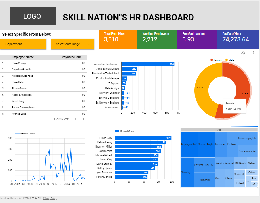
A company data management tool known as an interactive dashboard enables users to interact with data by recording, analyzing, monitoring, and displaying important business indicators. Users can explore operational data for a business in greater detail and apply various filters by using an interactive dashboard.
Table of Contents

Click Here for the Live dashboard Example: – https://lookerstudio.google.com/s/uaeSAjM_13o
Advantages of the creative and interactive dashboard
Productivity
Static reports have been useful for increasing productivity, but in today’s modern economies, this simply is not sufficient. Many static or paper sheets or millions of rows and columns cannot help as much as they used to because the amount of data that needs to be analyzed is constantly increasing. Users are now able to work independently with the data and make use of cutting-edge technologies thanks to the proliferation of self-service BI tools.
Speed
There is no denying the importance of speed in today’s competitive digital environment for any business. Data is manually updated once when using conventional spreadsheets or PowerPoint presentations. It is unnecessary to do so with modern reporting tools. The essence of BI’s beauty and power is that real-time dashboards enable real-time data.
Lower involvement of IT
A company can save valuable IT resources by allowing users to conduct their own ad hoc data analysis, which will significantly reduce the number of requests for database queries or customizations. The IT department can then focus on other important or urgent tasks, and users can quickly get answers to important questions about the business.
Reduce duplicate reports
Instead of making ten static PowerPoint slides, you can quickly modify the displayed data using just one tool with cutting-edge interactive capabilities. Intelligent data alerts and real-time data are used in reports, allowing users to completely eliminate spreadsheets and presentations. When an anomaly occurs, the alarm will notify the user, and neural networks will ensure accurate detection and forecasting for the future.
Readiness for leaders
Users are given the ability to respond to important questions whenever they want using the most recent data when the analytical process is interactive. Furthermore, information can be taken a gander at according to alternate points of view and perspectives with only a couple of snaps. You can view data in a more comprehensive manner than ever before by zooming in and out, detailing time intervals, filtering countries, and showing and hiding specific parameters you don’t need.
Interactive dashboard features
Let’s take a closer look at some of the features that make interactive dashboards tick now that we know what they are and how they work.
Quick filters
Users of interactive dashboards can modify the data they are viewing in a dashboard with quick filters without affecting other users’ access to the dashboard. A user might be able to quickly filter to only display sales figures for the northeast if an interactive dashboard shows sales figures for all 50 states.
Drill down
Users of interactive dashboards can access deeper layers of data beneath the dashboard’s top level thanks to this feature. Drilling down might enable a user to click on a single state to view the sales numbers by city within that state, reusing our sales-by-state example from above.
Chart zoom
Chart zoom, in contrast to, say, a photo editing app’s zoom, enables interactive dashboard users to zoom in on a particular section of a chart to view more in-depth data for that section. Chart Zoom, for instance, might enable a user to zoom in on a five-year period from 2000 to 2005 and view month-by-month sales figures for that view if the user is looking at year-by-year sales figures from 1990 to 2020.
Widgets
Users can set up integrations between their business intelligence software and other software to automatically import data from a dependable data source using interactive dashboard widgets. A user could, for instance, make an interactive widget that pulls data from their accounting software automatically, allowing them to create monthly financial reports without having to manually pull in new data.
Custom Chart Tooltips
There are numerous examples of interactive dashboards that offer levels of customization based on their level of sophistication. Custom chart tooltips are one prominent feature that can be changed to show specific element details. This choice empowers you to change the shown data when you drift over it with your mouse giving a little piece. Let’s say you have a stacked bar graph with a number of different categories. Your hovering information can be changed on:
All categories,
a single category
custom text added to a category (for example, for additional explanations), sums, averages, percentages, etc.
Free creative and interactive dashboard
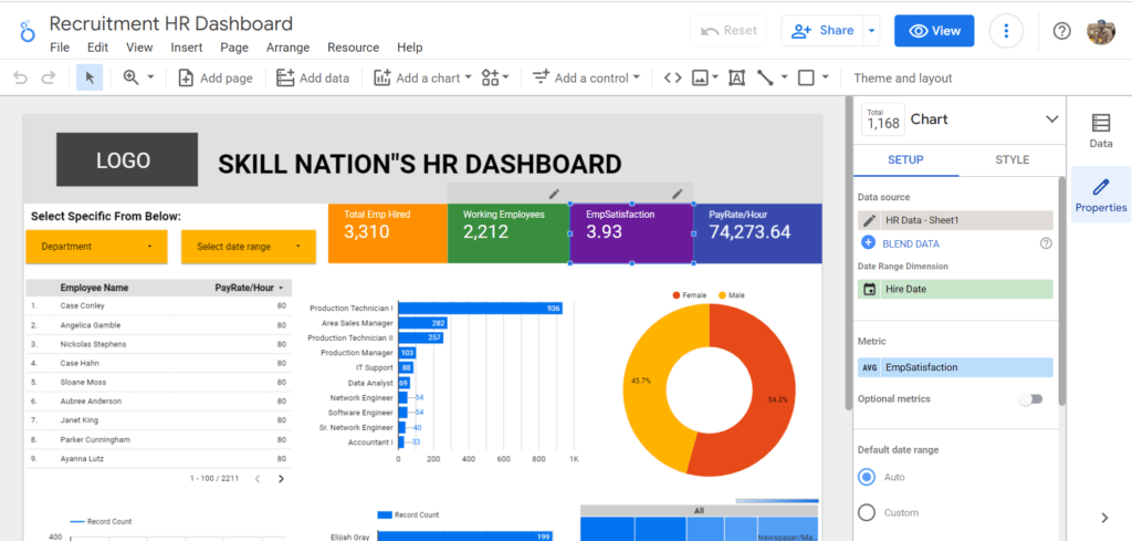
We can create a free creative dashboard using the Google product i.e. lookerstudio. With the help of Lookerstudio the existing name is Google Studio, we can create a much more attractive dashboard.

We need to follow a few steps for creating the dashboard
- Sign in to your Google account
- open https://lookerstudio.google.com/
- Once the link opens we have to get readymade templates or create blank reports
- Looker Studio provides more than 23 Google connector options for importing the data like Google Analytics, MS Excel, Google Sheets, Youtube Ads, etc.
- Once imported the data we have multiple options to show data in attractive mode like charts, tables, filters, bars, and many other options
- Please Refer to Looker documentation for more details: https://cloud.google.com/looker-studio
FAQ
How Do I Create an Online Interactive Dashboard?
Creating an online interactive dashboard allows you to visually represent data and provide interactive features for users. Here are some steps to guide you through the process:
Define the Purpose and Scope: Determine the purpose of your dashboard and the specific data you want to display. Clearly define the goals and objectives of the dashboard to guide your design and development process.
Gather and Prepare Data: Collect the data you want to showcase in your dashboard. Ensure the data is accurate, relevant, and properly organized. Clean and transform the data as needed to make it suitable for visualization.
Choose a Dashboard Tool or Platform: Select a dashboard tool or platform that suits your needs and skill level. Popular options include Tableau, Power BI, Google Data Studio, and D3.js. Consider factors such as ease of use, available features, and compatibility with your data sources.
Design the Layout and Visuals: Plan the layout and structure of your dashboard. Decide on the types of charts, graphs, and other visual elements that best represent your data. Keep the design clean, intuitive, and visually appealing, ensuring the information is easy to understand and navigate.
Connect and Import Data: Connect your data source to the chosen dashboard tool and import the relevant datasets. This may involve connecting to a database, importing spreadsheets, or connecting to an API. Configure the data connections to ensure real-time or periodic data updates.
Build Interactive Elements: Enhance your dashboard’s interactivity by adding features like filters, drop-down menus, drill-down options, and hover-over tooltips. These elements enable users to interact with the data, explore different perspectives, and gain insights.
Configure Data Interactions: Define how the visualizations and elements will interact with each other and the underlying data. For example, ensure that selecting a specific data point updates other visualizations or filters the data accordingly.
Test and Iterate: Test your dashboard to ensure it functions as intended. Validate the accuracy of the displayed data and verify that the interactive features work smoothly. Gather feedback from potential users and make any necessary adjustments or improvements.
Publish and Share: Once your dashboard is ready, publish it to a web hosting platform or share it through the chosen dashboard tool. Ensure proper security measures are in place if the data is sensitive. Provide clear instructions on how to access and navigate the dashboard.
Maintain and Update: Regularly review and update your dashboard as new data becomes available or user requirements change. Continuously monitor its performance and address any issues or bugs that arise.
By following these steps, you can create an online interactive dashboard that effectively visualizes your data and provides users with a seamless and engaging experience.
What is the benefit of the interactive dashboard?
You can drill down into operational data and filter it using an interactive dashboard, allowing you to see it from different angles or in greater detail. Data-driven business decisions are made possible by dashboards, which present the overall business figures in a concise and understandable manner.
What are the advantages of interactive reporting?
The benefits of Interactive Reports are abundantly clear. Users can engage in active exploration rather than passive consumption when viewing and analyzing data. The business manager can click to drill down for more specific information when they want to conduct a deeper analysis.
What is the best tool to create a dashboard?
ClickUp. Access ClickUp across all devices.
Zoho Analytics.
DashThis.
Smartsheet.
Google Data Studio (Looker Studio)
Can Tableau dashboard be interactive?
Yes, Tableau dashboards can indeed be highly interactive. Interactivity is one of the core strengths of Tableau, allowing users to engage with the data visually and dynamically. With Tableau, you can create interactive dashboards that enable users to explore data, drill down into specific details, apply filters, change parameters, and even interact with visualizations to gain deeper insights. By incorporating features such as tooltips, filters, and actions, Tableau empowers users to interact with the data and customize their analytical experience, fostering a more engaging and intuitive data exploration process. This interactivity not only enhances user experience but also enables effective data analysis and storytelling, making Tableau a powerful tool for data visualization and decision-making.
Why are interactive dashboards important?
Interactive dashboards are important for several reasons. Firstly, they enable users to actively engage with data and explore different perspectives, leading to a deeper understanding of the information at hand. By allowing users to interact with visualizations, apply filters, and drill down into specific details, interactive dashboards empower individuals to tailor their analysis and uncover valuable insights. Secondly, interactivity enhances user experience, making the data exploration process more intuitive and enjoyable. It promotes a sense of ownership and control, enabling users to extract relevant information efficiently and answer ad hoc questions on the fly. Lastly, interactive dashboards facilitate effective communication and collaboration. They allow users to present data in a dynamic and interactive manner, enabling stakeholders to interact with the information, ask questions, and derive meaningful conclusions together. Overall, interactive dashboards foster a more engaging, insightful, and collaborative data analysis experience, making them an essential tool for decision-making and data-driven organizations.
Can Excel create interactive dashboard?
Yes, Excel can create interactive dashboards. While Excel may not offer the same level of interactivity and customization as specialized dashboard tools like Tableau, it provides features and functionalities that allow users to build interactive dashboards within the Excel environment. Users can leverage features such as data validation, slicers, pivot tables, and conditional formatting to create interactive elements within their Excel dashboards. These features enable users to filter and manipulate data, drill down into specific details, and dynamically update visualizations based on user selections. With careful design and utilization of Excel’s interactive features, users can create engaging and functional dashboards that facilitate data exploration and analysis.
What is the difference between static and dynamic dashboard?
The key difference between static and dynamic dashboards lies in their level of interactivity and the ability to update in real-time. A static dashboard presents fixed information that does not change unless manually modified by the user. It typically consists of pre-defined visualizations and data snapshots that provide a snapshot of a specific point in time. On the other hand, a dynamic dashboard is highly interactive and capable of updating automatically or in response to user actions. It allows users to explore and manipulate data, apply filters, change parameters, and view real-time updates. Dynamic dashboards enable users to interact with the data, drill down into details, and customize their analysis, offering a more flexible and adaptable data exploration experience. Ultimately, dynamic dashboards provide real-time insights and facilitate agile decision-making, while static dashboards offer a static view of data without the same level of interactivity and responsiveness.
Click Here for a technology-related post: Want a Career in Technology? Make This Your Secret Weapon


Pingback: Best websites for converting videos from YouTube to MP3 - Hidden Thinker